

.

General information
Location
375 Park Avenue, New York, New York, NY
Status
Complete
Constructed
1957
Use
Office
Height
Roof
516 ft (157 m)
Technical details
Floor count
38
Companies involved
Architect(s)
Ludwig Mies van der Rohe; Phillip Johnson
Architecture
This structure, and the International Style in which it was built, had enormous influences on American architecture. One of the style's characteristic traits was to express or articulate the structure of buildings externally.[1] It was a style that argued that the functional utility of the building’s structural elements when made visible, could supplant a formal decorative articulation; and more honestly converse with the public, than any system of applied ornamentation. A building's structural elements should be visible, Mies thought. The Seagram Building, like virtually all large buildings of the time, was built of a steel frame, from which non-structural glass walls were hung. Mies would have preferred the steel frame to be visible to all; however, American building codes required that all structural steel be covered in a fireproof material, usually concrete, because improperly protected steel columns or beams may soften and fail in confined fires.[2] Concrete hid the structure of the building — something Mies wanted to avoid at all costs — so Mies used non-structural bronze-toned I-beams to suggest structure instead. These are visible from the outside of the building, and run vertically, like mullions, surrounding the large glass windows. Now, observers look up and see a "fake and tinted-bronze" structure covering a real steel structure. This method of construction using an interior reinforced concrete shell to support a larger non-structural edifice has since become commonplace. As designed, the building used 1,500 tons of bronze in its construction.[3]
On completion, the construction costs of Seagram made it the world's most expensive skyscraper at the time, due to the use of expensive quality materials and lavish interior decoration including bronze, travertine, and marble. The interior was designed to assure cohesion with the external features, repeated in the glass and bronze furnishings and decorative scheme.
Another interesting feature of the Seagram building is the window blinds. As was common with International Style architects, Mies wanted the building to have a uniform appearance.
Plaza
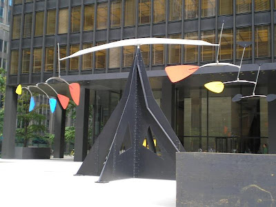
The Seagram Building and Lever House, which sits just across Park Avenue, set the architectural style for skyscrapers in New York for several decades. It appears as a simple bronze box, set back from Park Avenue by a large, open granite plaza. Mies intended to create an urban open space in front of the building, despite the luxuriousness of the idea, and it became a very popular gathering area indeed. In 1961, when New York City enacted a major revision to its 1916 Zoning Resolution, the nation's first comprehensive Zoning Resolution, it offered incentives for developers to install "privately owned public spaces" which were meant to emulate that of the Seagram's Building; the following 40 years of development in Manhattan did so with relatively little success.[citation needed]
The Seagram Building's plaza was also the site of a landmark planning study by William H. Whyte, the American sociologist. The film, Social Life of Small Urban Spaces,[6]
Barcelona Pavilion
Alternate names
German Pavilion
Type
Exhibition building
Architectural style
Modernism
Structural system
steel frame with glass and polished stone
Location
Barcelona, Spain
Client
Government of Germany
Started
1928
Completed
1929
Inaugurated
1929-05-27
Demolished
1930 (rebuilt in 1986)
Alternate names
German Pavilion
Type
Exhibition building
Architectural style
Modernism
Structural system
steel frame with glass and polished stone
Location
Barcelona, Spain
Client
Government of Germany
Started
1928
Completed
1929
Inaugurated
1929-05-27
Demolished
1930 (rebuilt in 1986)
Building
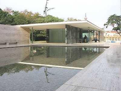
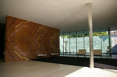
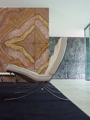
Mies's response to the proposal by von Schnitzler was radical. After rejecting the original site because of aesthetic reasons, Mies agreed to a quiet site at the narrow side of a wide, diagonal axis, where the pavilion would still offer viewpoints and a route leading to one of the exhibition's main attractions, the "Spanish Village".[5] The pavilion was going to be bare—no trade exhibits—just the structure, a single sculpture and purpose-designed furniture (the Barcelona Chair). This lack of accommodation enabled Mies to treat the Pavilion as a continuous space; blurring inside and outside. "The design was predicated on an absolute distinction between structure and enclosure—a regular grid of cruciform steel columns interspersed by freely spaced planes".[6] However, the structure was more of a hybrid style, some of these planes also acted as supports.[7] The floor plan is very simple. The entire building rests on a plinth of tavertine. A southern U-shaped enclosure, also of travertine, helps form a service annex and a large water basin. The floor slabs of the pavilion project out and over the pool—once again connecting inside and out. Another U-shaped wall on the opposite side of the site also forms a smaller water basin. This is where the statue by Georg Kolbe sits. The roof plates, relatively small, are supported by the chrome-clad, cruciform columns. This gives the impression of a hovering roof.[8] Robin Evans said that the reflective columns appear to be struggling to hold the "floating" roof plane down, not to be bearing its weight.[9] Mies wanted this building to become "an ideal zone of tranquility" for the weary visitor, who should be invited into the pavilion on the way to the next attraction. Since the pavilion lacked a real exhibition space, the building itself was to become the exhibit. The pavilion was designed to "block" any passage through the site, rather, one would have to go through the building. Visitors would enter by going up a few stairs, and due to the slightly sloped site, would leave at ground level in the direction of the "Spanish Village". The visitors were not meant to be led in a straight line through the building, but to take continuous turnabouts. The walls not only created space, but also directed visitor's movements. This was achieved by wall surfaces being displaced against each other, running past each other, and creating a space that became narrower or wider.
Mies's response to the proposal by von Schnitzler was radical. After rejecting the original site because of aesthetic reasons, Mies agreed to a quiet site at the narrow side of a wide, diagonal axis, where the pavilion would still offer viewpoints and a route leading to one of the exhibition's main attractions, the "Spanish Village".[5] The pavilion was going to be bare—no trade exhibits—just the structure, a single sculpture and purpose-designed furniture (the Barcelona Chair). This lack of accommodation enabled Mies to treat the Pavilion as a continuous space; blurring inside and outside. "The design was predicated on an absolute distinction between structure and enclosure—a regular grid of cruciform steel columns interspersed by freely spaced planes".[6] However, the structure was more of a hybrid style, some of these planes also acted as supports.[7] The floor plan is very simple. The entire building rests on a plinth of tavertine. A southern U-shaped enclosure, also of travertine, helps form a service annex and a large water basin. The floor slabs of the pavilion project out and over the pool—once again connecting inside and out. Another U-shaped wall on the opposite side of the site also forms a smaller water basin. This is where the statue by Georg Kolbe sits. The roof plates, relatively small, are supported by the chrome-clad, cruciform columns. This gives the impression of a hovering roof.[8] Robin Evans said that the reflective columns appear to be struggling to hold the "floating" roof plane down, not to be bearing its weight.[9] Mies wanted this building to become "an ideal zone of tranquility" for the weary visitor, who should be invited into the pavilion on the way to the next attraction. Since the pavilion lacked a real exhibition space, the building itself was to become the exhibit. The pavilion was designed to "block" any passage through the site, rather, one would have to go through the building. Visitors would enter by going up a few stairs, and due to the slightly sloped site, would leave at ground level in the direction of the "Spanish Village". The visitors were not meant to be led in a straight line through the building, but to take continuous turnabouts. The walls not only created space, but also directed visitor's movements. This was achieved by wall surfaces being displaced against each other, running past each other, and creating a space that became narrower or wider.


